
To state the obvious, if a sign isn’t noticed by your customers, it has no value other than possibly as a sun or wind screen. In order to be noticed, a sign needs to:
- Be the proper size
- Be in the right location
- Have great colors and contrast
When shopping your store, many customers will not necessarily be actively looking for your message. Therefore, your signs must be easily seen and “heard.” One of the foundations of a good sign is that it is the proper size.
Size up your signs
Proper sign size depends on three things:
- How much information you need to communicate
- How far away the viewer is when they see your sign
- How long they have to process your message. Will they be standing, walking or driving by at 30 mph or 60 mph when they see your sign?
With all these variables, there is no simple mathematical formula that provides a foolproof answer. However, for every 1 inch of letter height, you can add 10 feet of distance for optimal reading and 25 to 30 feet for maximum readability (see chart below).
Do not approve a sign solely by what you see on screen. Be sure to evaluate the size of the words in the real world. Learning from others is the easiest way to get the size and content right. If you are planning on a roadside sign, drive down a street that has the same speed limit as yours. Find signs that have roughly the same amount of information you have and are easily seen and understood as you drive by. Use those as the basis for yours.

Apply a similar approach for signs in your parking lot and in and around your garden center. Take a tape measure with you to other retail locations. Pick signs that are easy to read from a comparable distance to what you need at your store. Measure both the sign dimensions and letter height. Be sure to also document from how far you can easily read it. Of course, make adjustments to that distance based on how well or poorly you see compared to your average customer.
Additionally, you can use any of your existing signs as a basis. Are they easily readable from the same distance customers will see your new sign? If not, make the necessary adjustments in the design.
Location, location, location
Before installing your sign, be sure to evaluate the proposed sign location from where and how your customers will see it. Think about:
- What angle will they see the sign?
- Will they be walking, standing, sitting or driving?
- How will lighting affect visibility? If outside, keep in mind the lighting difference from sunrise through sunset.
- Will plant growth block some or all of the sign?
- Will additional, potentially distracting visual elements be added later?

Color considerations
It is quite common for people to be disappointed with the lack of “pop” on their actual signs versus what they approved on a monitor. Similar to font size, approving color choices based solely on what you see on a computer screen can result in signs that are difficult to read or that lack visual appeal. Again, learning from others is a great way to eliminate mistakes. Keep your eyes open and note what color combinations catch your eye and are easily read. In general, you will want high contrast; light colored text on dark colors and vice versa.
Be “heard”
If you have the right size sign in the right location, your message now has a chance of being heard. To help increase the probability that you communicate effectively, it’s important to use the right words, symbols when appropriate, and images to complement the text.

Choose words wisely
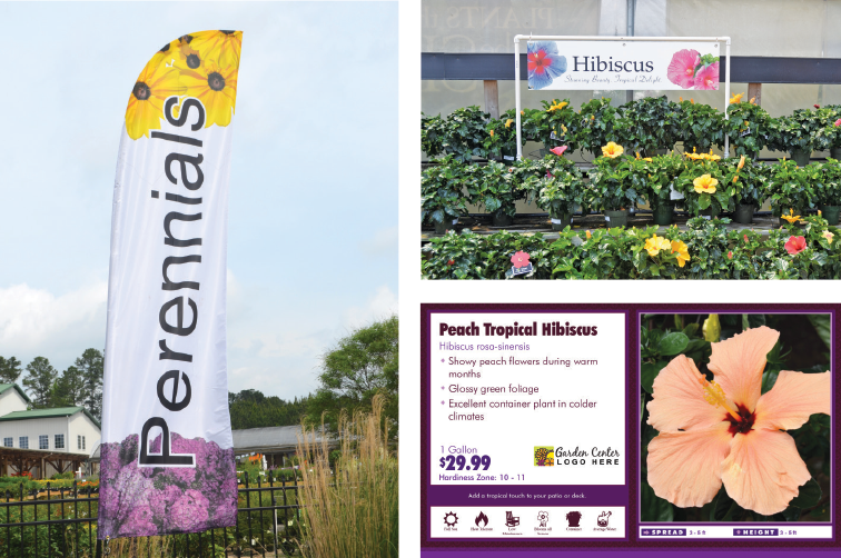
The two most common content errors are 1) adding too much information and 2) using industry and technical terms that are not understood by your average customer. Keep the amount of text on your signs to a bare minimum. If they can’t be scanned, they typically won’t be read. Of course, the closer the sign is to the item being sold, the more text your sign can have (see images below),
When selecting words, be sure to use your customers’ vocabulary if it’s different than the technical or industry lingo. For example, are you a “nursery” or a “garden center?”

Use symbols when possible
If you can use symbols in place of words, you may be able to communicate more with less. In some cases, you many need to educate your customers about what a symbol means. However, once they have learned it, it can be used. For example, consider the plant characteristic symbols (above).
“A picture is worth a thousand words” is an exaggeration and cliché, but it is true that the right image can certainly communicate on its own or help reinforce the text.
Be dependable
Once you have the right size and location with the right message, the final decision is to select the proper sign material to ensure your sign will hold up over time. There are a lot of choices, but the three most commonly used are coroplast, vinyl and mesh.
Coroplast
Coroplast stands for “corrugated plastic.” It is great for placing in A-Frames, securing to structures and hanging in areas where there is limited wind. Coroplast signs are printed on 8-foot-by-4-foot sheets and then cut to size. Signs can be single or double sided. Grommets are typically added to the corners to facilitate installation.

Vinyl
Vinyl is flexible and can be rolled up for shipping and storage. However, it makes installation a bit trickier, as you need to ensure it is stretched taut to look good. Vinyl comes in a variety of different qualities and thicknesses. If the sign will be hung outdoors, request vinyl with a block-out layer so that light will not bleed through the sign and make it difficult to read. Signs can be single or double sided. Grommets are added to the corners, and for larger signs, additional grommets are added every 2 linear feet around the edges. To reinforce the sign there are two additional options:
- Hemming: Folding the vinyl over and sewing it together for reinforcement. This is done prior to adding grommets.
- Webbing: Sewing in a nylon ‘belt’ in the hemming fold. Grommets are then added. This makes the edges of the banner quite strong.

Mesh
Mesh is flexible like vinyl. It is perforated and is ideal for windy areas as they let approximately 37 percent of air through the small holes. With the holes, the printed image is not as sharp as on vinyl or coroplast. However, it is lighter weight and is great for large signs. Mesh can be only be single sided. Mesh must have both hemming and webbing as well as grommets.
As a reminder, keep your eyes open and take note of signage solutions that work and don’t work from various retail locations. Snap pictures with your phone, and keep a tape measure handy so you can benefit from the experience – both the expertise and mishaps – of others. It will help ensure your signs do their job by educating and informing your customers, and it will save you time and money.
Explore the January 2019 Issue
Check out more from this issue and find your next story to read.
Latest from Garden Center
- GS1 US Celebrates 50-Year Barcode 'Scanniversary' and Heralds Next-Generation Barcode to Support Modern Commerce
- Weekend Reading 7/26/24
- Retail Revival: Making gardening contagious
- ‘Part of our story’
- Registration now open for Garden Center Fertile Ground Webinar Series
- Dramm introduces new hose, sprinkler attachments for home gardeners, nurseries
- Meet the 15 Retailers' Choice Awards winners from Cultivate'24
- 2024 Top 100 Independent Garden Centers List


